Encore.
Wordmark, mark, colors, type. SVG is the canonical source. PNGs at 256, 512, and 1024 are pre-rendered for places that don't take SVG. Use what fits the surface.
01 · Wordmark
For headlines, signatures, press.
Use the wordmark whenever you have horizontal space. The spark-red period is part of the mark. Never crop, recolor, or remove it.


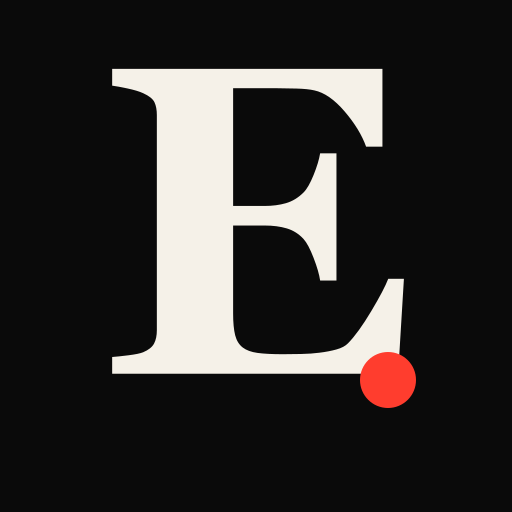
02 · Mark
For avatars, app icons, tight spaces.
When the wordmark won't fit, use the “E.” mark. Square aspect, works at any size from favicon to keynote.


03 · Colors
Three colors, no exceptions.
Ink
#0a0a0a
Background, headlines, primary text on light surfaces
Bone
#f5f1e8
Body text on dark surfaces, light backdrops, cream tone
Spark
#ff3d2e
Accent only. The period, highlights, calls to action
04 · Type
Editorial restraint.
Fraunces
Display + headline (web app live wordmark)
Variable serif, used at SOFT 0 / weight 900. Google Fonts.
Georgia / Times New Roman
Logo SVGs, fallback serif
Used in the static brand SVGs so the wordmark renders without font embedding wherever the file is opened.
Inter
Body, UI
Sans, weights 300–700.
JetBrains Mono / system mono
Labels, tracking-widest uppercase
All small-caps mono labels (`STAGE`, `DOWNLOADS`, etc.) use the system mono.
Usage
- Always pair the wordmark or mark with adequate breathing room. At least the height of the “E” on every side.
- Never recolor the spark-red period. It's the only place the spark color appears in the mark, and that contrast is the identity.
- Do not stretch, skew, rotate, or apply effects to the marks. Drop them flat against backgrounds that pass the contrast test.
- If you need a variant we don't ship here (different size, vector format, custom layout). Email contact.